Introduction
How themes work in RVE
React Video Editor (RVE) supports full theming, meaning you can change the look and feel of the entire editor (colors, backgrounds, borders, overlays, etc.) with one setting. This guide explains how it all works without needing to dive deep into technical details.
RVE Default Themes
Here are the three themes currently available in RVE:
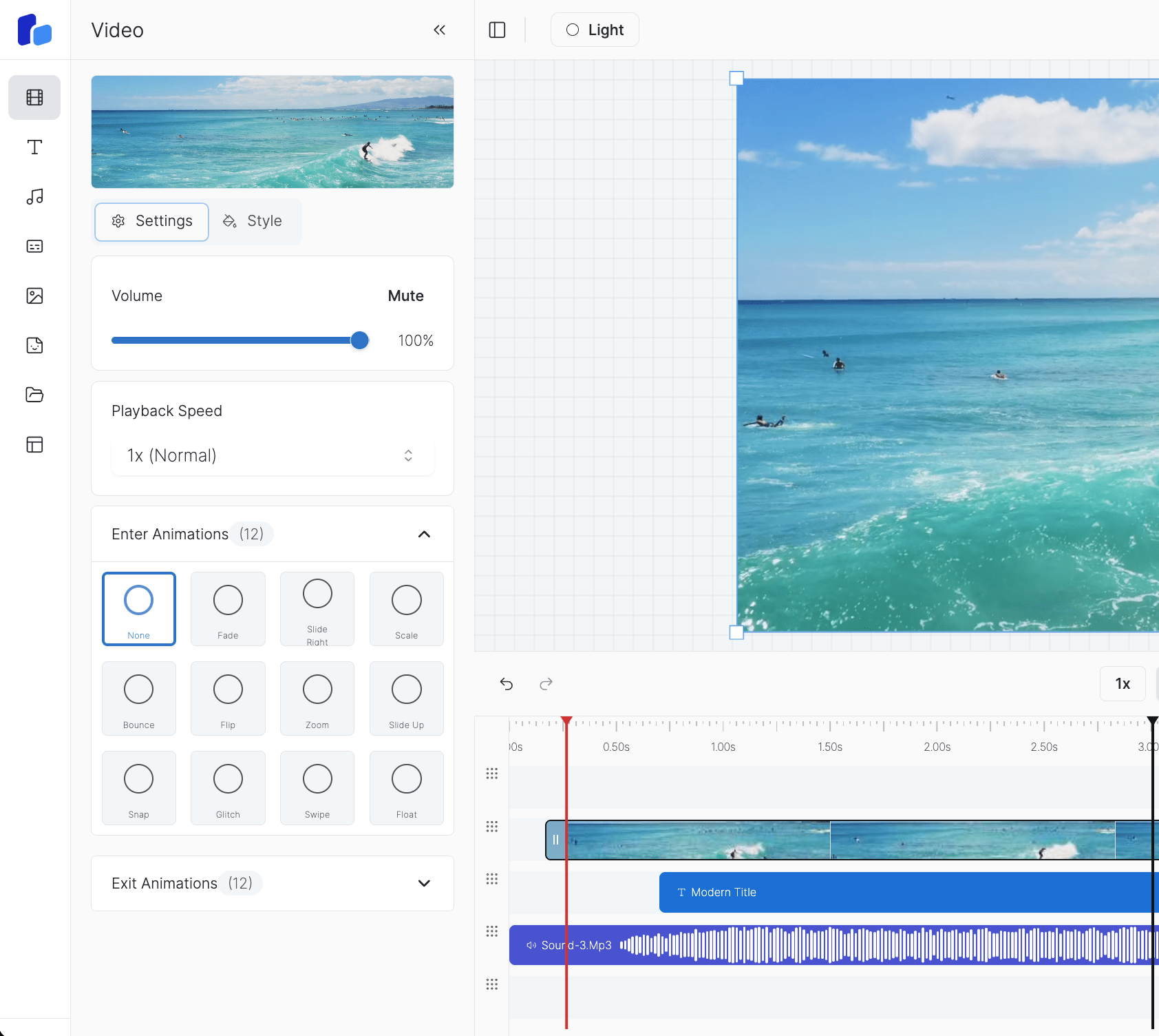
Light Theme
Clean, bright interface
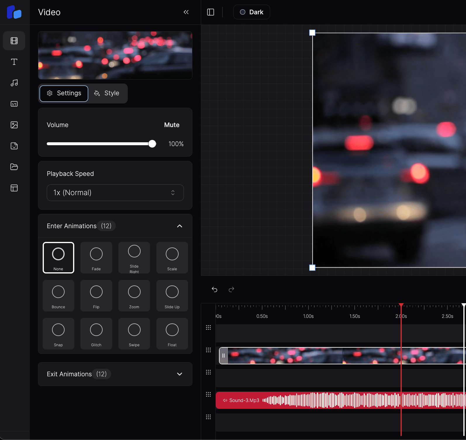
Dark Theme
Easy on the eyes
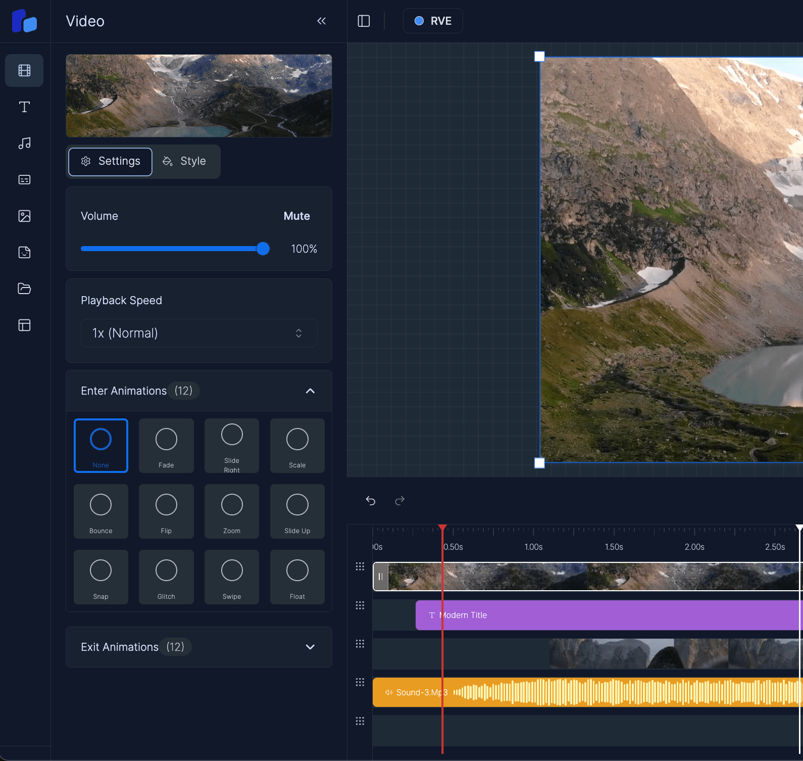
Brand Theme
RVE's signature colors
What Themes Do
Themes control the visual style of RVE. You can switch between light, dark, or custom themes. When the theme changes, the entire app updates automatically, without needing to rewrite any components.
You never set specific colors like bg-red-300 or text-white inside components. Instead, RVE uses semantic class names like bg-primary or text-foreground. These are linked to your theme's color values behind the scenes.
How Theming Works Behind the Scenes
Here’s the big picture: the theming system has three main parts working together.
1. styles.css – The Theme Hub
This is the main CSS file that ties everything together. It does two things:
- Imports each theme file (like
light.css,dark.css,rve.css) - Ensures CSS variables are available globally for Tailwind to use
Think of it as the bridge between your color definitions and Tailwind’s utility classes. You won’t edit much here, just make sure new themes get imported.
@import './light.css';
@import './dark.css';
@import './rve.css';
@import './my-theme.css'; /* Add new themes here */
2. tailwind.config.ts – Connecting Tailwind to Your Theme
Tailwind doesn’t know about your CSS variables until you tell it. This config file maps semantic names like primary, background, and border to the actual variables from your theme files.
This means when you write bg-primary in a component, Tailwind knows to look for the value of --primary from your current theme.
colors: {
  primary: {
    DEFAULT: 'var(--primary)',
    foreground: 'var(--primary-foreground)',
  },
  background: 'var(--background)',
  border: 'var(--border)',
}
You don’t need to touch this often, it’s already set up. Just know that this is what makes the color classes work properly with your themes.
3. Theme Files (.css) – Defining Your Theme’s Colors
Each theme has its own .css file. This is where you define actual color values for variables like --primary, --background, --border, etc.
Every theme uses the same variable names, it’s only the values that change. That’s what allows you to switch themes without touching component code.
.rve,
[data-theme='rve'] {
  --primary: hsl(215, 88%, 47%);
  --background: hsl(215, 25%, 97%);
  --border: hsl(215, 16%, 82%);
}
Themes are applied using CSS classes on the <html> tag. So when the app switches to the rve theme, the .rve class is added to the document, and all these values take over.
Using Themes in Components
Inside your React components, always use semantic class names like:
<div className="bg-primary text-primary-foreground border-border" />Never use hardcoded Tailwind colors like bg-red-300 or text-white. That would lock in specific colors and break the whole theming system.
By using the right semantic classes, your components will work with all themes, light, dark, custom, or anything added later.
What Happens When You Switch Themes
When the user picks a new theme (via the dropdown or programmatically), here’s what happens:
- The old theme class is removed from the
<html>element - The new theme class (like
.rve,.my-theme) is added - CSS variables update instantly based on the new theme
- Tailwind utility classes like
bg-primarynow point to the new values - Your UI updates automatically, without re-rendering every component
No color values are changed manually. The switch is global and instant.
Why We Avoid Hardcoded Colors
Here’s the main reason:
- Hardcoded classes like
bg-blue-500don’t adapt to different themes - If you change themes, that color stays the same, and looks wrong
- Semantic class names like
bg-primaryautomatically use the right color for the current theme
So again: don’t hardcode colors. Stick to the system and your UI will always look right.
Summary
styles.cssimports all theme files and exposes CSS variablestailwind.config.tsmaps those variables to Tailwind class names- Theme
.cssfiles define actual color values - Components use semantic classes (
bg-primary, notbg-red-300) - When you switch themes, the entire app updates instantly and consistently
This setup makes it easy to maintain, extend, and brand your editor, without ever needing to touch color values inside components.