Whitelabelling
Why you might whitelabel RVE
If you're integrating RVE into your product, you may want it to feel like a seamless part of your own brand. Not a third-party tool. That’s where whitelabelling comes in.
Whether you're launching an internal tool, embedding RVE in a customer dashboard, or building a branded video creation experience, RVE's theming system makes full visual control possible.
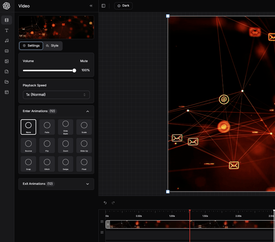
Example Whitelabel
OpenAI-Inspired RVE Instance
Here's a real-world example of RVE whitelabeled to match OpenAI's design system. Notice how the editor seamlessly adopts the familiar dark theme, typography, and color palette that OpenAI users recognize.
This demonstrates how you can create a video editing experience that feels like a native part of your existing product ecosystem.
Why You Might Whitelabel
Here are some common reasons:
1. You already have brand guidelines
Your product may have defined colors, typography, and spacing rules. With RVE theming, you can reflect those directly in the editor UI.
2. You want to run RVE on a separate page
Maybe you're launching a standalone /editor route where users create and manage videos. With whitelabelling, you control the look and feel so it fits your company or client brand.
3. You want to push customers into a custom editor
Some teams use RVE as the foundation for their own editor, letting customers create, edit, or export branded video templates. A custom theme ensures the entire experience feels like it’s yours.
How to Whitelabel RVE
Here’s how to create and apply a fully custom theme.
Step 1: Create a Theme File
Create a new CSS file for your theme (e.g. my-theme.css) and define your variables:
.my-theme,
[data-theme='my-theme'] {
  --primary: hsl(156, 80%, 40%);
  --background: hsl(0, 0%, 100%);
  --border: hsl(0, 0%, 90%);
  --radius: 0.5rem;
}
Use your brand colors here. These will drive every color used across the UI.
Step 2: Import It Globally
Open styles.css and import your new theme:
@import './my-theme.css';This ensures Tailwind can access the new CSS variables.
Step 3: Register Your Theme in the App
In your app entry point (e.g. page.tsx), register the theme so it shows up in the theme switcher:
const availableThemes = [
  {
    id: 'my-theme',
    name: 'My Theme',
    className: 'my-theme',
    color: '#22c55e',
  },
];
Example Setup
export default function MainApp() {
  const availableThemes = [
    {
      id: 'my-theme',
      name: 'My Theme',
      className: 'my-theme',
      color: '#22c55e',
    },
  ];

  const lambdaRenderer = React.useMemo(() =>
    new HttpRenderer('/api/latest/lambda', {
      type: 'lambda',
      entryPoint: '/api/latest/lambda'
    }), []
  );

  return (
    <ReactVideoEditor
      projectId="your-project-id"
      fps={30}
      renderer={lambdaRenderer}
      availableThemes={availableThemes}
      showDefaultThemes={false} // Optional: hide default ones
    />
  );
}
Step 4: Customize the Sidebar Logo
Replace the default RVE logo with your own brand logo by using the sidebarLogo prop:
import { Star } from 'lucide-react'; // Or import your own icon/logo component

export default function MainApp() {
  const availableThemes = [
    {
      id: 'my-theme',
      name: 'My Theme',
      className: 'my-theme',
      color: '#22c55e',
    },
  ];

  const lambdaRenderer = React.useMemo(() =>
    new HttpRenderer('/api/latest/lambda', {
      type: 'lambda',
      entryPoint: '/api/latest/lambda'
    }), []
  );

  return (
    <ReactVideoEditor
      projectId="your-project-id"
      fps={30}
      renderer={lambdaRenderer}
      availableThemes={availableThemes}
      showDefaultThemes={false}
      sidebarLogo={<div className="text-2xl font-bold"><Star className="text-primary" /></div>}
    />
  );
}
You can use any React component as the logo:
- Icons: Use Lucide React icons, Heroicons, or any icon library
- Custom SVG: Import your own SVG logo component
- Text: Simple text-based logos with custom styling
- Images: Use
<img>tags with your logo file
The logo will appear in the top-left corner of the editor sidebar, giving users a clear visual connection to your brand.
Step 5: Use Semantic Classes in Components
Your UI components should use semantic Tailwind classes like:
<div className="bg-primary text-primary-foreground border-border" />No need to change these when switching themes — that’s the power of semantic design.
The Full Theming Flow
- Theme
.cssfiles define your brand’s actual colors styles.cssimports them and exposes CSS variablestailwind.config.tsmaps those variables to Tailwind class names- Your components use semantic utility classes
- The theme switcher updates the
<html>class globally
Notes
- You can create as many branded themes as you want
- Each customer or workspace could have a unique look
- Use
showDefaultThemes={false}if you only want your custom themes shown